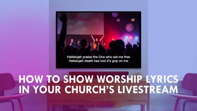
Moving backgrounds have become a mainstay for a great number of churches in recent years.
As software has become more affordable, and great motion designers have become more plentiful, even older churches have started to see the great visual value that motion graphics can add to any service. However, moving backgrounds can severely detract from a service instead of adding depth and beauty to the moment if they’re implemented poorly. There are several factors that have an effect on whether a moving background works or ultimately fails. Whether you’re purchasing, designing, or just thinking of using motion graphics in your service, here are 5 things you should consider about moving backgrounds.
SIMPLICITY & READABILITY
While that background with a thousand spinning gold crosses and a twirling array of sunlight in the background looks tempting, you may not be able to read lyrics when they’re displayed over the top of it. Using picture and video can be amazing, but they require a lot of careful thought to be implemented properly. Motion graphics work best as moving backgrounds when they work in conjunction with the lyrics on the screen. Lots of varying patterns, shapes, flashing and moving colors, or intricate imagery with movement in the background can take away from the readability of lyrics. Simple patterns, shapes, and colors in subtle motion can add depth while giving your lyrics a background to be easily read from.
Suggested Tweet: "Motion graphics work best as moving backgrounds working in conjunction w/ lyrics on screen. @TravisWalser"
LIGHTS AND ENVIRONMENT
Taking your place of worship’s environment into consideration can also help when selecting the best motion for you. The color, size, and layout of your space can have a huge effect on whether a motion graphic works to it’s full potential in your presentation. For example, we’ve learned over the last few years that the color yellow does not work well in our space. Because of the wall color, lighting, and size of our venue we try to stay away from using a heavy amount of yellow during our services. Instead, we stay with warmer more reddish hues or blue cooler colors. and we choose backgrounds accordingly during our service programming when using movement.
TRANSITIONS
When you’re designing a worship service with motion graphics, one of the most often overlooked pieces of the service are the transition of one motion to the next. A bad transition can leave people feeling slightly lost, overwhelmed, or with a general feeling that something is off. Carefully considering the transition of one moving graphic to the next can help glue the whole service together and bring a sense of continuity to the entire production.
Suggested Tweet: "Considering the transition of one moving graphic to another can glue the whole service together @TravisWalser"
SERMONS AND SERIES
When designing visuals for a service it’s always important that everything feels cohesive. That doesn’t just mean that the color matches, or that the sermon series overlay fits for your screens. It means that everything feels like it belongs. A great way to add that depth to your service is to choose backgrounds with the current sermon series or topic artwork in mind. I’ve been in a service where the theme was in black and white and that theme was carried throughout the church from the foyer to the screens. That depth, that cohesiveness, can really bring an extra layer of involvement and impact to a service. Things you can look at when trying to find that similar feel are color, pattern, shapes, and common elements.
Motion graphics can add depth, variety, and a visual landmark for people as they move through worship. They can add depth and a sense of awe to services. Choosing a great motion can change so much about your service that it makes sense to spend time carefully considering each element. I hope this has helped you identity a few things that you can focus on in your next worship service!
Suggested Tweet: "Motion graphics can add depth, variety & a visual landmark for people through worship. @TravisWalser "


