

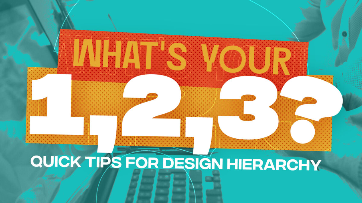

‘What’s Your 1, 2, 3? Quick Tips for Design Hierarchy’ blog post was posted with permission from the author Mark Macdonald.
We prefer order over disorder. We love hearing a sermon if we understand the simple outline. Most also prefer a list of things as long as we understand it’s overarching topic.
But when presenting anything in a series, there is a universal serial effect. The first and last items are best remembered. This happens naturally if everything appears to be equally weighted. We want to shove something to the top and allow something to be very tertiary.
To control this (and do the prioritizing), it comes down to design skills when applying communication to a tool or channel. That requires design abilities!
The difference between effective and bad design? Design Hierarchy
Miller’s Rule says most want fewer than 7 things in a list. But from my experience, most will remember (and prefer) 3 things. And when you have only 3 things, if they’re presented equally, most will remember the first. When pressed, the last is recalled. We create the hierarchy because we want it!
How do you make design hierarchy work for order and balance?
All communication needs hierarchy. We love numbered lists. And we crave to understand the BIG #1 idea. When talking about a poster, web page, or social media graphic, you need to ask what the 1, 2, and 3 things are. In hierarchy.
Something needs to feel most important — your #1. I’d consider resisting adding anything else. But for most communication, someone usually wants to add something else. Just make sure a #2 is related to the #1 but clearly take a secondary place. If you “have” to add a #3, make it tertiary.
Here are 3 hierarchy tips from decades of asking “what the 1, 2, 3” are in a design:
- Look what you’ve designed. What’s the one big message? Is it the largest thing? Is it in the headline? The biggest picture?
- Is everything else secondary? Does anything battle for attention? If you can’t quickly tell the difference between the #1 and the #2; you have hierarchy issues. Here’s how to solve them:
– Make one larger and/or one smaller. Make it more obvious!
– Bold a font to nudge it to the #1 position.
– Consider contrast of colors. The more contrast, the more it’ll become a #1.
– Position on the page will also set hierarchy. #1 at the top, #2 below it. - Ask if the #3 is needed. Does it add clarity to #1 or #2 or does it introduce another topic? Always better to remove if it’s not clearly related. If you still think it’s needed, be sure to reduce the #3 so it takes a back seat to your #2. Or lower it on the design.
Stop having competing components on a design and you’ll create peaceful tools that people will love to look at and quickly understand the big takeaway. That’s great communication!

Make Your Church Unforgettable: FREE 25 Game-Changing Resolutions
Transform your church communication in 2025! Discover 25 game-changing resolutions from 24 years of Be Known For Something Church Branding Co expertise. Download Mark MacDonald’s free guide and make it your best year yet!

unlimited church visuals, one subscription
Get unlimited access to our Media Library of over 40,000 instant, downloadable graphics and videos for adult, student and kids ministries. Plus Unlimited Custom Graphics and Video Production and free access to over 1,000 church media training resources to help you visually communicate the Gospel. All in one place.