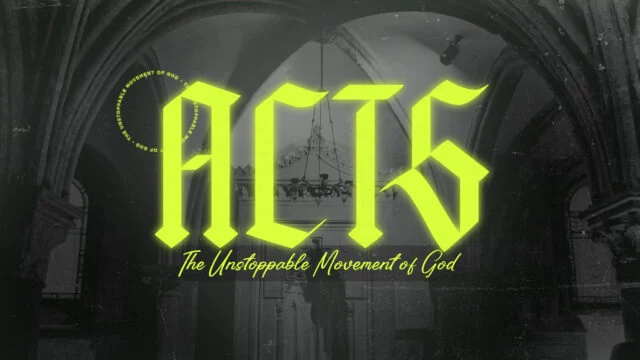
We’ve all seen sermon slides that are… ok. They get the job done. The main points are up there. The scripture is readable. But something feels off – like the visuals aren’t helping the message land the way it could.
In many churches, slide design is treated like a simple checklist:
☑️ Add points
☑️ Insert Scripture
☑️ Make it readable
But what if we thought of slide design as communication, not just presentation? What if the way we design actually helps people remember, reflect on, and respond to what’s being preached?
Let’s look at how intentional slide design can reinforce your pastor’s message — and why good visuals are more than just decoration.
Visuals Are Part of the Message
Before we get tactical, let’s set the foundation: Slides are part of the message.
In a visual-first world, people often see before they hear. And what they see on screen can either support the message — or distract from it. Great design doesn’t just deliver information; it helps truth stick.
If your church uses slides during teaching, then your visual team is helping preach the gospel — visually. That’s a big deal. So the goal isn’t just to “make it look nice.” It’s to serve the Word by removing friction and creating visual clarity.
Use Visual Hierarchy to Highlight What Matters
Not all words should be equal on a slide. When everything is bold, nothing is bold.
Visual hierarchy is the art of guiding attention — using size, weight, spacing, and color to show what matters most. It answers the question:
“Where should my eyes go first?”
Here’s a quick cheat sheet:
- Make the big idea big. Don’t bury it in a paragraph.
- Use boldness sparingly. Emphasize key words, not full sentences.
- Break apart long thoughts. Use multiple slides if needed — less is more.
The goal is to emphasize important truths visually — so people remember them.
Whitespace Isn’t Wasted Space
Church slides often suffer from a “fill the space” mindset. More points, more Scripture, more words. But in design, emptiness is powerful.
Whitespace (aka negative space) creates breathing room. It focuses attention. It adds calm. It’s how you visually say, “This matters — pause and sit with it.”
Here’s a principle:
Every slide should have one main idea.
If it doesn’t, break it apart. Give that one truth room to linger. Let it breathe — and it will land deeper.
Type Emphasis Makes Your Words Speak Louder
Typography is one of the most underused tools in church slide design. It’s not just about what you say — it’s how the words look on screen.
Try these tips:
- Use contrast: Pair large headlines with smaller subtext.
- Be consistent: Stick with one or two fonts that match your church’s tone or sermon series.
- Highlight keywords: Bold, uppercase, or slightly color-tinted — but don’t overdo it.
RENEWANATION
RenewaNation equips families, churches, and schools to help children develop a strong biblical worldview. Through training, resources, camps, and hands-on experiences, they inspire the next generation to think and live biblically.

Pair Slides with Supportive Visuals
Visuals aren’t required for every sermon slide, but when used well, they can deepen meaning and create emotional connection.
Some ideas:
- A subtle motion background that supports the mood (not distracts).
- A photographic metaphor — like glowing embers for a message on refinement.
- Color palettes that match the sermon tone (e.g., warm earth tones for parables, cool blues for lament).
Just remember: your image shouldn’t say something different than the message. Avoid cheesy clip art or on-the-nose metaphors. Subtlety wins.
Presentation Software Tips for Better Slide Design
If you’re building slides in a presentatoin software of your choosing, here are a few practical ways to implement the principles above:
- Create reusable templates with clear hierarchy, consistent margins, and font sizes.
- Use Slide Themes to apply consistent formatting across sermon series.
- Break longer phrases into one-liner slides — just like a social media post.
- Test readability in a real room — not just on your laptop.
Don’t just think like a designer — think like a communicator. One way to do this is export your slides you create and show them to your pastor and let him see and speak into the slides.
Design to Serve, Not Steal
Slides should support the message, not compete with it.
The most beautiful slide in the world is a distraction if it pulls attention away from the Word. Good design doesn’t show off — it gets out of the way.
When in doubt, ask:
“Does this slide help someone hear what God is saying?”
If yes, you’re on the right track.
Preach Visually. Disciple Through Design.
Designing great sermon slides isn’t just about aesthetics — it’s about discipleship. It’s about helping people focus, feel, and follow along with what God is saying through the message.
So next time you build slides, think beyond bullet points. Think visually, how is this slide or set of slides going to land. Let design be a bridge, not a barrier.


